Portfolio

Moving Valmeyer: GIS Parcel and Roads Update

In this project, I worked as a GIS analyst to update parcel and road data for Valmeyer, Illinois, which was relocated to mitigate flood risks. Using ArcGIS Pro, I updated the parcel dataset with new attributes, including mean, minimum, maximum elevation, and slope. These updates support property assessment and emergency management analysis.

Additionally, I digitized a new road network to reflect the town’s relocation, providing essential routing data for emergency response. The final outputs were published as a public web map on ArcGIS Online found below, including:

Old parcel data (single color symbology)
New parcel data (symbolized by mean elevation)
Digitized roads layer

This project involved spatial analysis using Zonal Statistics and raster processing techniques to ensure accurate data integration for future planning and disaster preparedness.

Wildfire Impacted Areas

This map created in ArcGIS Pro analyzes the impact of wildfires on California counties. The project involved overlaying county boundaries with wildfire perimeters to calculate the total burned area within each county. Using geoprocessing tools such as Dissolve, Intersect, and Summary Statistics, I determined the percentage of each county affected by wildfires and visualized the results through a thematic map. The final map, styled using Natural Breaks classification, highlights the varying degrees of wildfire impact across the state. This project strengthened my spatial analysis skills and introduced key GIS workflows for environmental impact assessment.

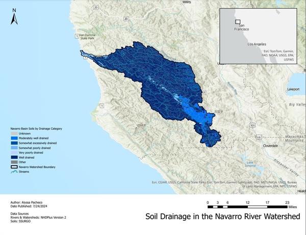
Navarro River Watershed Map

For this project, I completed a three-part tutorial in ArcGIS Pro, focusing on data visualization, analysis, and cartographic design.

In Part 1, I learned how to navigate ArcGIS Pro, add data layers, and apply symbology to enhance data visualization. I also explored selection tools to subset data and familiarize myself with fundamental GIS conventions.

Part 2 Built upon this foundation by introducing data frames, projections, and attribute tables. I performed geoprocessing tasks to analyze spatial data and applied advanced symbology techniques to refine map presentation.

Part 3, I finalized the project by designing a complete, professional-quality map. This included adding essential cartographic elements such as a title, legend, north arrow, scale bar, and an inset map for spatial context. The final product was exported as a ready-to-share PDF map.

This project strengthened my skills in ArcGIS Pro, from basic data management to advanced spatial analysis and map production.

Car Sales and Profit Analysis for Swift Auto Traders

In this project I acted as a data scientist at SwiftAuto Traders, tasked to analyze car sales and profits across dealerships and present findings through Excel visualizations and IBM Cognos dashboards. In Excel, I created pivot-based charts, including a bar chart for Quantity Sold by Dealer ID, a line chart for Profit by Date and Model, and a column chart for Profit by Year and Dealer ID. Additional analyses include a formatted line chart for Hudson Model Profits by Dealer.

In Cognos, I used the Auto Group Data Module to build two dashboards. The Sales Dashboard captures key KPIs such as total profit, quantity sold, and a column chart of Profit by Dealer ID. The Service Dashboard includes visualizations for Recalls per Model, Customer Sentiment, Monthly Sales vs. Profit, and Recalls by System using a heat map. The final dashboards are exported as a PDF report for submission, providing data-driven insights for dealership performance.

Fleet Inventory Data Cleaning and Analysis

In this assignment, I acted as a Junior Data Analyst in a local government office, tasked with cleaning and analyzing fleet inventory data. The project involved converting a CSV file to XLSX, adjusting column widths, and formatting the data as a table. Data cleaning includes removing empty rows, duplicates, extra spaces, and fixing spelling errors. Department names, which were split across two columns, must be merged using Flash Fill. After structuring the data, I used AutoSum to calculate key metrics (SUM, AVERAGE, MIN, MAX, COUNT) and create a pivot table displaying department names and equipment counts, sorted in descending order. Two identical pivot tables were created for further analysis—one organizing data by department and equipment class, the other by equipment class and department. The final results is prepared for visualization in a dashboard and a data findings report.